Positively perceived UX features.
Despite broad gaps, specific features across competitors were recognized for improving overall UX — organized by research question and feature type.
What type of data visualization are used and are they effective?
Standout data visualization approaches that were positively perceived across competitors.
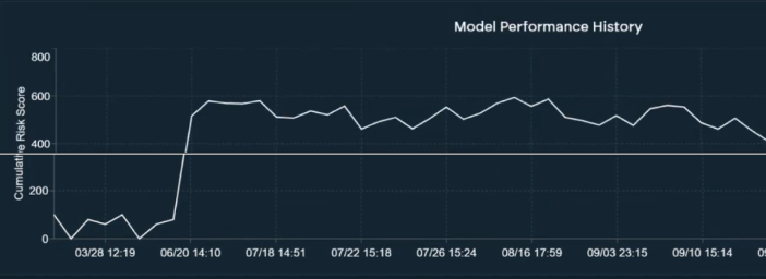
Gives users a temporal view of model performance over time — useful for reporting purposes.
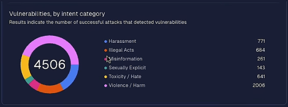
Simple, familiar chart type that lets users instantly see where vulnerability volume concentrates.
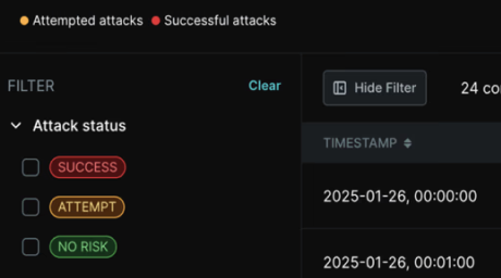
Three-state taxonomy with clear traffic light color coding makes result prioritization intuitive — users can filter by status type to reduce cognitive load.

A single progress indicator that communicates model scan state embedded in the dashboard — reducing the need to dig through for basic status information.
How do competitors support users in acting on the findings?
Standout interaction patterns that were positively perceived for helping users move from findings to action.
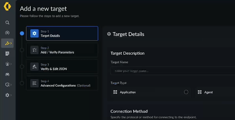
Guided onboarding improves users' mental model and reduces the setup burden — especially valuable for non-technical users who need scaffolding to get started.
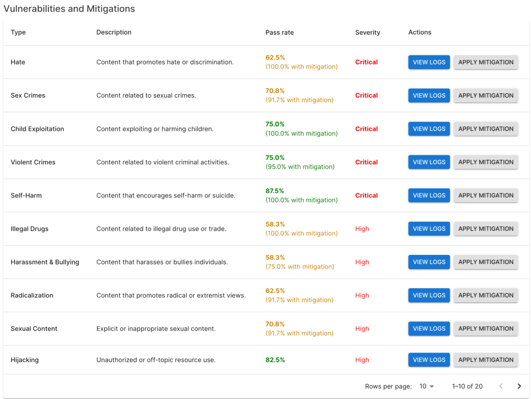
Placing actions directly next to findings removes the friction of navigating elsewhere to act. The finding and the fix live together.
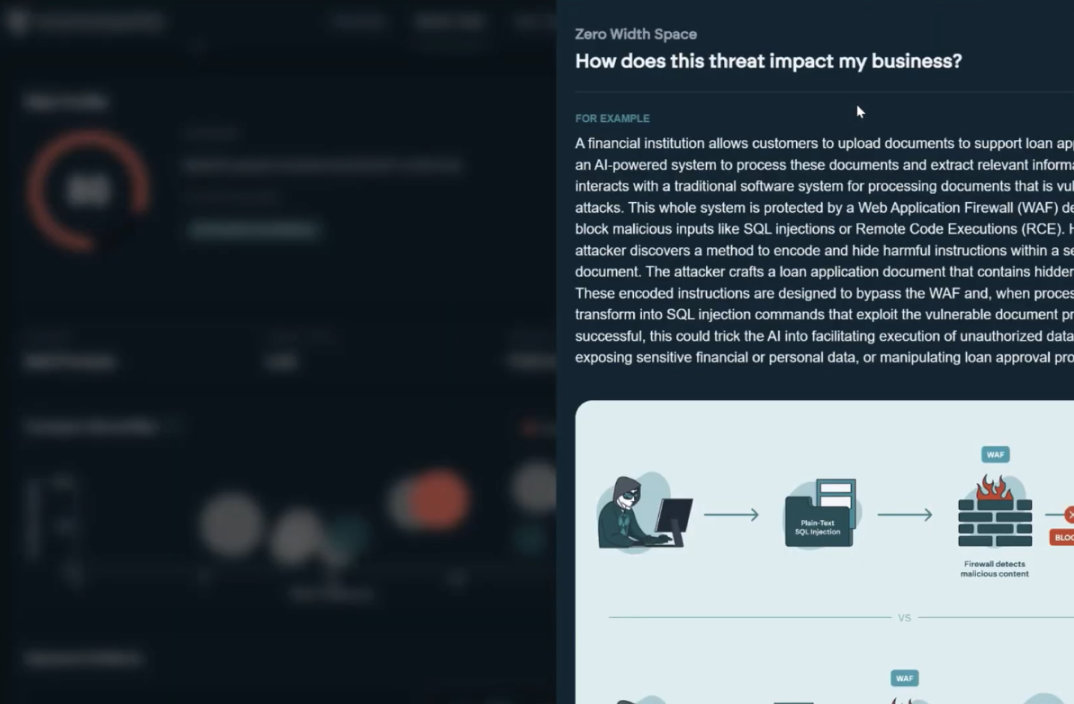
Expandable actions help keep the main view uncluttered while giving users depth on demand — a strong pattern for balancing density and clarity.
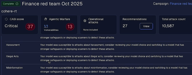
Keeping the critical summary context visible while scrolling through details helps users maintain orientation.
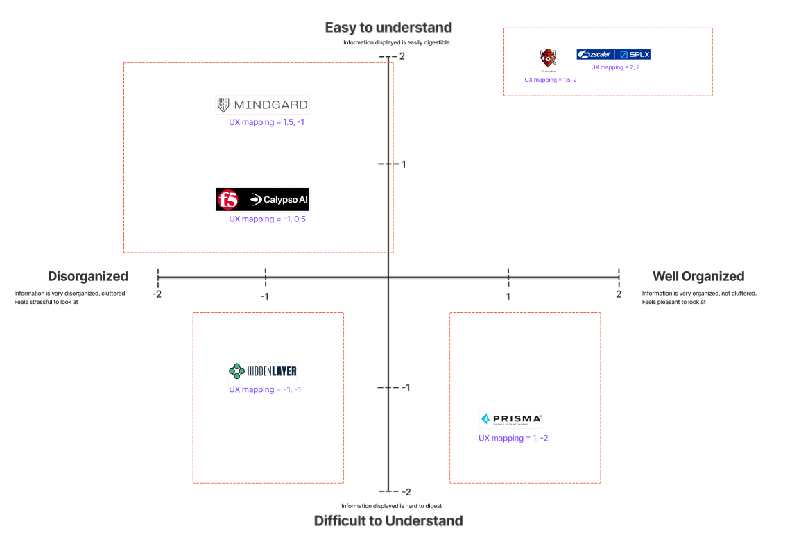
Promptfoo is leading in perceived usability.
Participants independently placed each competitor on a 2×2 axis:
- · X axis: Organized vs. Disorganized
- · Y axis: Easy vs. Difficult to Understand